Graphic Design & Art Portfolio
A showcase of my multi-disciplinary artwork and design projects
Overview
My creative journey in art and graphic design is a multi-faceted extension of my technical discipline. Trained through Arcadia High School’s rigorous Graphic Design curriculum (Introductory and Advanced levels), I learned core principles of composition, color, and typography while mastering industry-standard tools like Adobe Photoshop, Illustrator, and InDesign. Through challenging projects – ranging from fine art sketches to real-world client posters – I honed an innovative eye for detail, strong visual communication skills, and the ability to problem-solve creatively. This artistic foundation complements my software engineering pursuits, giving me a unique perspective that fuses technical precision with creative design thinking.
Below is a curated portfolio of my artwork and design projects, grouped by category. Each piece is accompanied by a brief description, highlighting the context, techniques, and impact or recognition received.
Fine Art & Sketches
Still Life – Pear (2024)
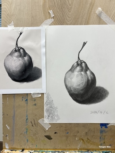
A detailed pencil still-life drawing of a pear, completed in early 2024. This piece showcases meticulous shading, texture rendering, and light contrast to capture realism. Drawing from life, I focused on subtle tonal variations and form, demonstrating growth in my observational drawing skills.
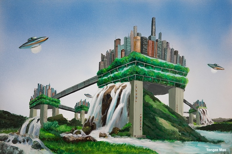
“The Future City” – International Competition Painting (2017)

An imaginative mixed-media painting depicting a futuristic city, created for the Future Art China International Competition in 2017. This artwork was selected as one of the Top 100 paintings out of over 10,000 global entries – a distinction that led to its exhibition in major cities (Beijing, Shanghai, Guangzhou, Hunan) and at the Lincoln Center in New York City. I invested over a month in this piece: researching avant-garde architecture (e.g. Google’s Toronto smart city plans) and sustainable design concepts, then integrating those ideas into my own vision of a harmonious future metropolis. Technically, I experimented with diverse techniques – including traditional brushwork and spray-painting – to create layered textures and a vibrant atmosphere. The painting’s recognition and international showcase not only honored my creative innovation, but also affirmed my ability to deliver complex projects under pressure.
Tibet Digital Collage (2018)
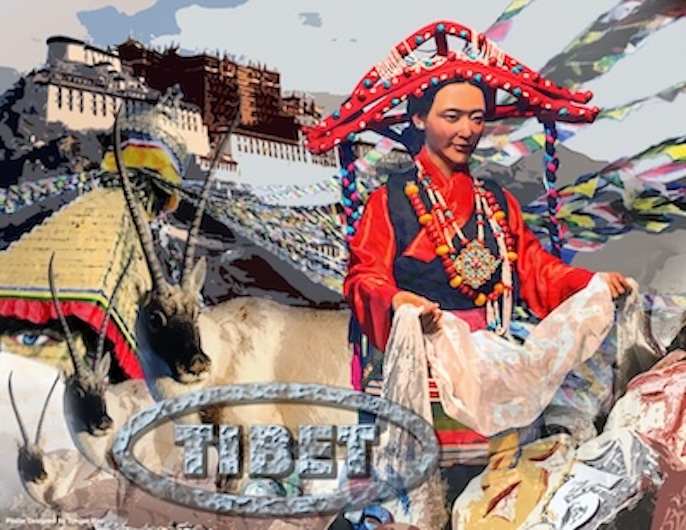
A vivid digital collage inspired by my travels to Tibet, completed in 2018. I combined personal photography, digital painting, and layered graphic elements using Photoshop and Illustrator to convey the serene beauty and spiritual atmosphere of the Tibetan landscapes. This piece’s modern composition and vibrant color scheme captured the imagination of viewers and was selected for Arcadia High School’s 2nd Annual Art Exhibition, where it was displayed to the broader community. It was also one of the standout works chosen for permanent display in the school’s art corridor, underscoring its impact.
Male Portrait Study (2017)
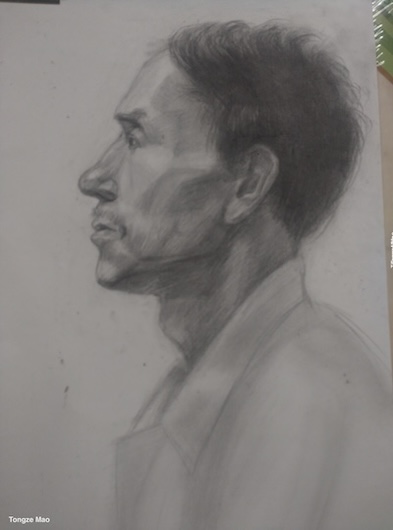
A pencil portrait of a man’s face, drawn in 2017 as a study of human features. Working from a reference, I paid close attention to anatomical proportions, light and shadow on skin, and fine details (such as hair strands and wrinkles). The finished sketch exhibits realistic shading and depth, reflecting disciplined practice in classical drawing techniques. This portrait was part of my broader effort in 2017 to build a strong foundation in observational art – training my eye to see minute details and improving hand-eye coordination.
Female Portrait Study (2017)
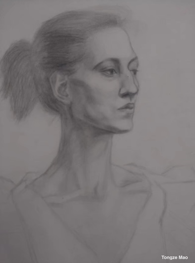
A companion to the male portrait, this is a graphite drawing of a woman completed in 2017. It emphasizes delicate facial features and soft shading to capture a gentle expression. Through this piece, I practiced rendering different textures (smooth skin, flowing hair) and the subtle gradients of value that give life to a portrait. These back-to-back portrait studies enhanced my understanding of human anatomy and portraiture, reinforcing my ability to approach challenges from multiple angles and with refined precision.
Hand Gesture Studies (2017)
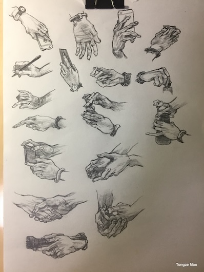
A collection of pencil sketches featuring numerous hand poses, drawn in 2017. Hands are notoriously challenging to draw, so I undertook this study to improve my grasp of complex anatomy and foreshortening. Over several iterative sketches, I captured hands in different gestures and perspectives – from relaxed open palms to clenched fists – paying attention to bone structure, knuckle placement, and shading to indicate volume. The resulting compilation demonstrates adaptability in technique and a commitment to mastering difficult subjects. Much like solving intricate coding problems, drawing hands taught me patience and iterative problem-solving: refining each attempt until the form and proportions were just right.
Skull Studies (2017)
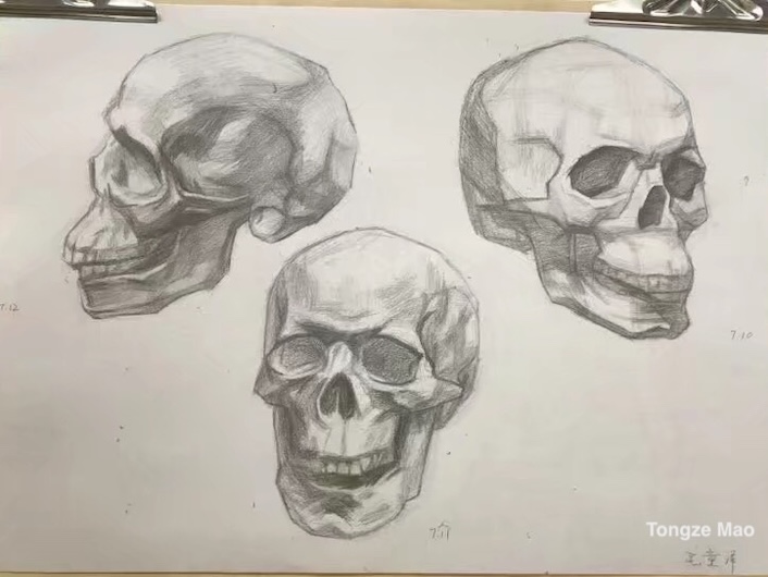
A pencil study of three human skulls, completed in 2017 to delve into skeletal structure and lighting. By drawing the skull from multiple angles, I learned to portray three-dimensional form through two-dimensional shading. Each skull is rendered with careful attention to the hard edges of bone and the subtle shadows within eye sockets and nasal cavities. This exercise in observation and precision improved my understanding of how light interacts with complex surfaces.
Classical Plaster Cast Studies (2017)
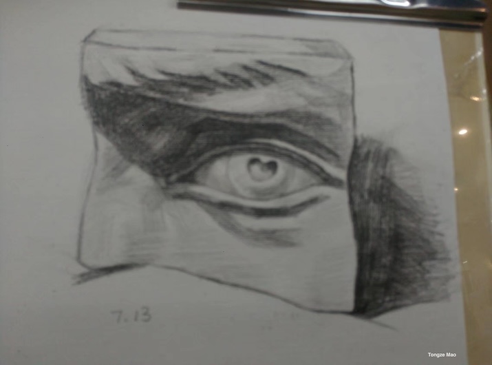
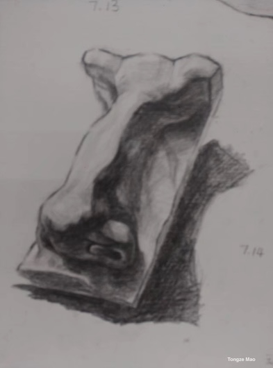
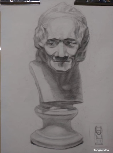
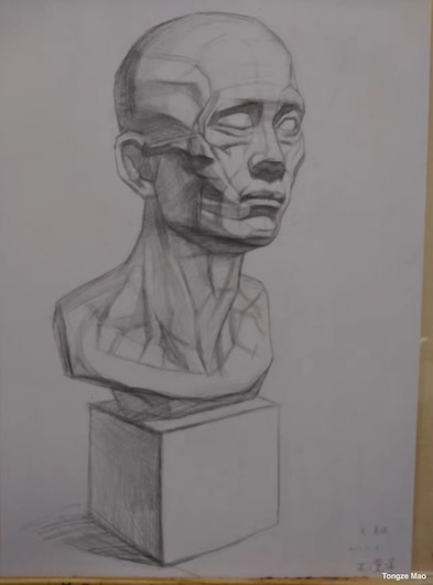
In 2017, as part of classical art training, I drew several plaster cast models to practice capturing form and light. Pictured above (left to right) are studies of a sculpted eye, a nose, the bust of Voltaire, and an anatomical head showing facial muscles. Each of these pencil drawings demanded high attention to detail and an understanding of how light and shadow define shape. For example, the Eye and Nose studies helped me grasp subtle value transitions on curved surfaces, while the Bust of Voltaire and Muscle Head sketches required rendering complex three-dimensional sculptures onto paper. These exercises improved my spatial reasoning and taught me to break down intricate structures into fundamental shapes.
Early Sketches – Still Life and Figure (2014)
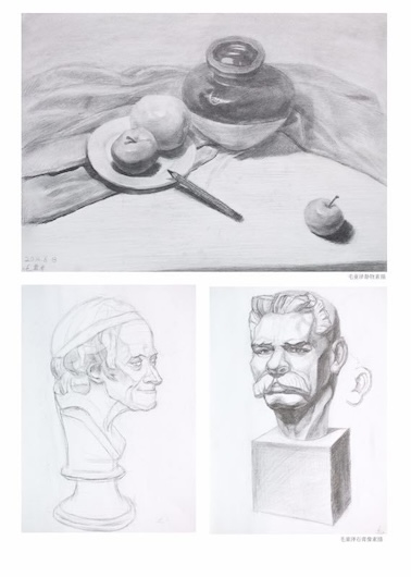
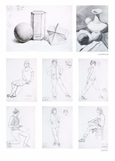
These two drawings represent some of my earliest art efforts, created in 2014 when I was only 13 years old. On the left is a still-life pencil sketch drawn from observation, and on the right is a quick figure sketch capturing a person’s pose. Even at that young age, I was experimenting with proportion, perspective, and shading. The still life shows an attempt to realistically depict objects with proper lighting and spatial arrangement, while the figure sketch demonstrates my budding ability to convey movement and human form with swift, confident lines. Together, they highlight an early passion for art and a willingness to practice fundamental skills.
Graphic Design & Posters
Orchesis Dance Company – Recruitment Poster (2019)
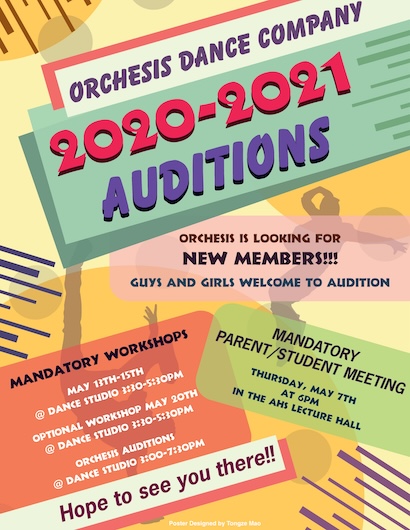
In late 2019, I was commissioned by the Orchesis Dance Company to create an engaging recruitment poster for their upcoming season’s tryouts. My design was ultimately selected from numerous submissions to become the official poster displayed prominently in and around the company’s studio and the school campus. I approached this project professionally: conducting in-depth research on Orchesis’s brand, ethos, and aesthetic style, and then crafting a visually compelling composition that embodied the energy and elegance of dance. Throughout the design process, I collaborated closely with company directors, presenting drafts and incorporating feedback in iterative cycles (much like agile software development). The final poster featured dynamic imagery and bold typography to capture attention. Its successful deployment enhanced Orchesis’s recruitment efforts, and the experience showcased my ability to deliver stakeholder-focused design solutions under real-world deadlines.
Dance Day Registration Flyer (2019)
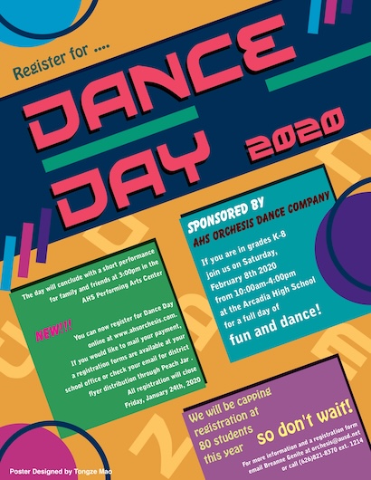
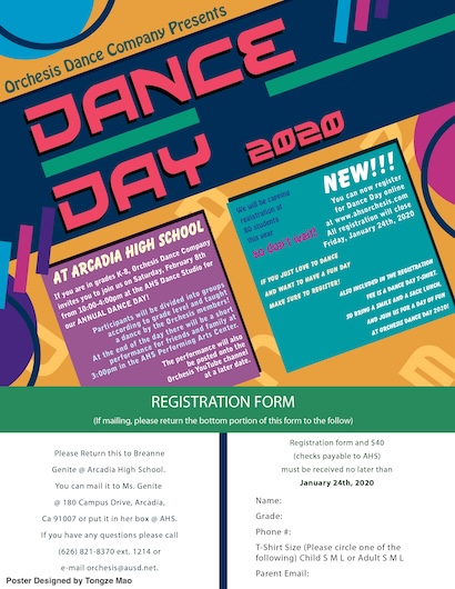
A two-sided flyer designed in 2019 to promote a “Dance Day” workshop hosted by the Orchesis Dance Company. The front (left image) of the flyer uses eye-catching graphics of dancers in motion and vibrant colors to grab students’ attention, while the back (right image) provides a clean layout for event details and a registration form. In this project, I balanced creative flair with informational clarity – ensuring the design was not only attractive but also effectively communicated the date, venue, and sign-up process. The flyers were distributed across campus to drive participation, and feedback from the organizers noted that the professional quality of the design helped boost interest in the event. This project further solidified my skills in Adobe Illustrator and InDesign, especially in creating print-ready layouts and managing typography for readability.
Social Science Classroom Posters Series (2019)
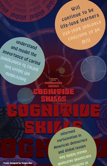
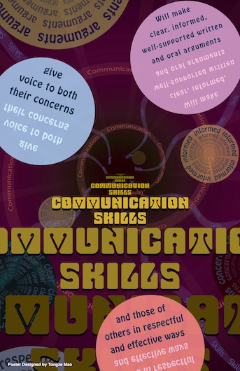
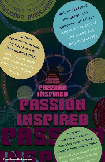
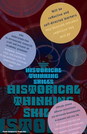
A series of four posters I created in 2019 for the Social Science department, aimed at inspiring high school students with important skills and mindsets. Each poster features a bold slogan or quote (for example, critical thinking prompts or motivational phrases) combined with strong visuals to reinforce the message – ranging from stylized icons to striking typography. These posters were displayed in Social Science classrooms to remind students of key values in their studies, and was selected for permanent display in the main corridor of our school’s academic building, as a daily inspiration for all students. This project highlights my ability to design educational content that is both visually appealing and pedagogically meaningful, as well as my versatility in adapting graphic style to different subject matters.
Motivational Poster for Middle School (2019)
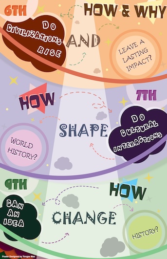
In 2019, I was also invited to design a motivational poster for a nearby school serving grades 6–9. The poster (pictured above) presents an inspirational question and engaging graphics intended to provoke curiosity and positive thinking among younger students. I kept the design age-appropriate, using bright colors and clear, friendly illustrations to ensure it resonated with middle schoolers. This poster was printed and placed in multiple classrooms, where it added a spark of creativity to the learning environment. The success of this piece demonstrated my capacity to tailor design tone and content to different audiences, as well as my commitment to using design for educational upliftment.
Air Pollution Awareness Poster (2019)
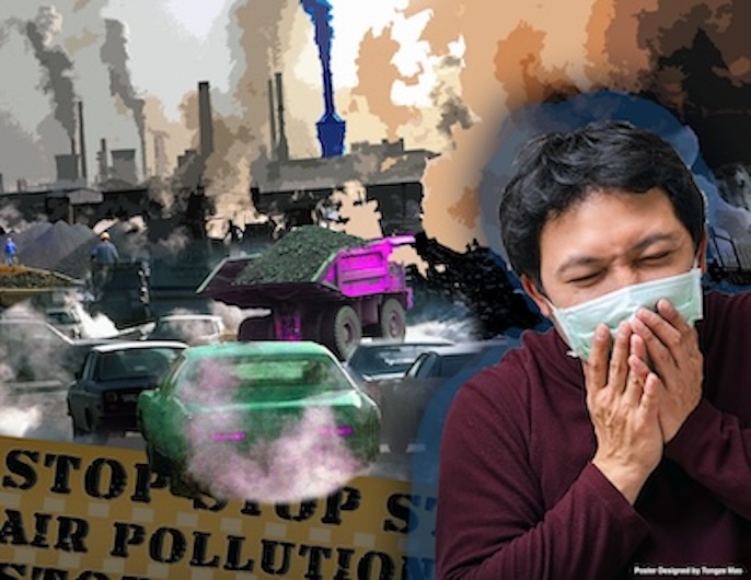
A public-awareness poster I created in 2019 to highlight the dangers of air pollution. This project challenged me to convey an urgent environmental message through visuals alone. I combined stark imagery (such as silhouettes of factories and polluted skies) with a limited color palette of smoky grays and toxic greens to dramatize the contrast between clean air and pollution. The design includes a bold headline warning and a call-to-action urging viewers to consider sustainable practices. Through careful composition and symbolic elements (like a gradually fading city skyline), the poster effectively communicates its point without excessive text. This piece reflects my belief in design as a tool for social impact and demonstrates how I can apply my skills to promote awareness on global issues.
Speech & Debate Team Poster – “Speech Follies” (2018)
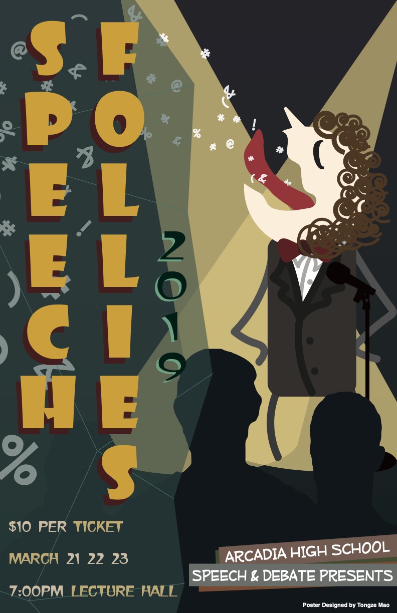
One of my proudest graphic design achievements was this poster for my school’s Speech and Debate Team, designed over winter 2018–2019. The school held a contest calling for student-created promotional posters, and my design was selected as the winner from dozens of submissions. Breaking away from the school’s traditionally conservative poster style, I developed a bold and modern concept. Using Adobe Photoshop and Illustrator, I incorporated dynamic visuals (including stylized speech symbols, vibrant geometric shapes, and a striking color scheme) to capture the excitement and intellectual energy of speech and debate. I drew inspiration from both past team posters and professional event marketing designs, ensuring the final product was unique yet fitting. The poster was printed in large format and displayed across every classroom and hallway on campus, as well as at external venues, to recruit and energize team members. Team members even paraded a giant version of the poster around campus to drum up interest.
Speech & Debate Event Program (2020)
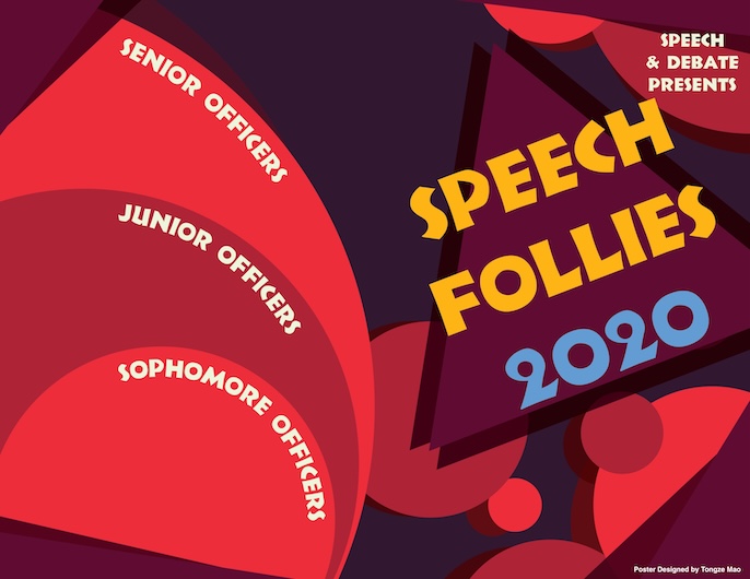
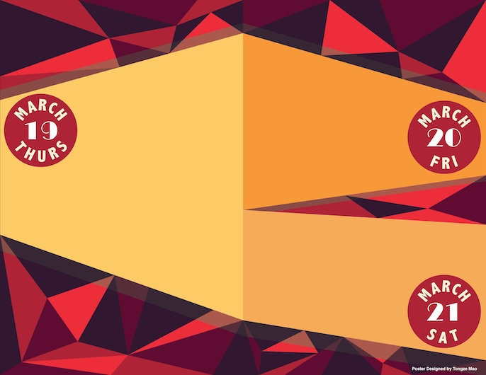
Following the success of the Speech & Debate poster, I was asked to design the program booklet for the team’s annual showcase event in 2020. Shown here are the cover page (left) and an inner page (right) of the program. I extended the visual theme established by the poster – using compatible fonts, colors, and graphic elements – to create a cohesive identity for the event’s materials. This project involved layout design and typesetting for multiple pages of content (event schedules, participant names, and acknowledgments), which I executed using Adobe InDesign for professional-level formatting. The challenge was to organize information clearly while still maintaining an engaging design that reflected the lively spirit of the Speech & Debate community. The completed programs were distributed at the event, and many attendees noted their polished, magazine-quality look.
Georgia O’Keeffe — Exhibit Bookmark & Interactive Invitation (2019)
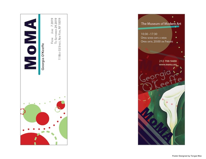
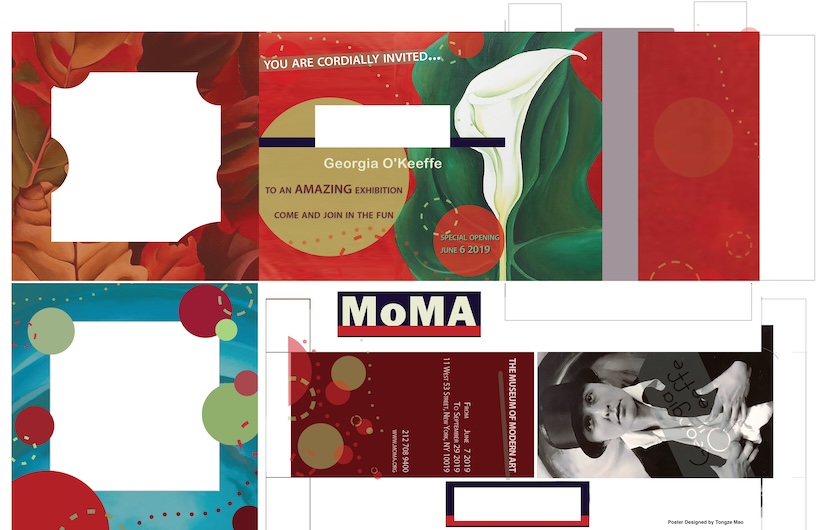
Concept & Role: MoMA-inspired promotional collateral for a themed exhibition about Georgia O’Keeffe.
What I did: Built a cohesive type system and gridded layout, balancing modernist restraint with bold focal imagery. The bookmark serves as a collectible teaser, while the invitation is an interactive cut-and-fold piece that reveals layered visuals. Why it matters: Demonstrates end-to-end collateral thinking (brand consistency, production readiness) and an ability to design for both screen and print with attention to materials, bleeds, and readability.
Inspirational Quote Poster (2018)
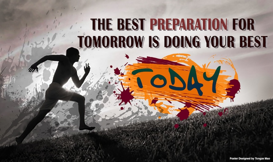
This is a motivational poster I designed in 2018, featuring an inspiring quotation rendered with creative typography and illustration. The aim was to uplift and encourage viewers in their daily school life. I experimented with lettering styles to emphasize key words in the quote and integrated subtle graphics that complemented the message’s theme. The composition balances whitespace with colorful accents, making the quote both readable and visually engaging. The poster struck a chord with faculty and students alike – it was selected for long-term display in the school’s main hallway, where it continues to brighten the atmosphere. Through this project, I learned how powerful visual communication can be in spreading positivity, and it reinforced my desire to create designs that have a meaningful emotional impact on the audience.
Music Icon Tribute Poster (2018)
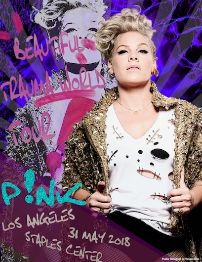
Designed in 2018, this poster is a personal creative project paying tribute to one of my favorite music artists. I set out to capture the artist’s persona and musical style through a single graphic composition. Using a mix of photo-editing and digital painting techniques, I created a stylized portrait of the singer surrounded by abstract elements (such as musical notes and rhythmic patterns) to symbolize their music. The poster’s color palette and mood were carefully chosen to reflect the tone of the artist’s work. This piece was well-received by my art instructors and peers, and it was one of the student artworks selected for year-round exhibition in the performing arts wing of our school. The tribute poster demonstrates my ability to blend artistic expression with design skill, creating a visually captivating piece without an explicit commercial or academic prompt – purely out of passion for art and music.
Orchesis Dance Company Event Flyer (2018)
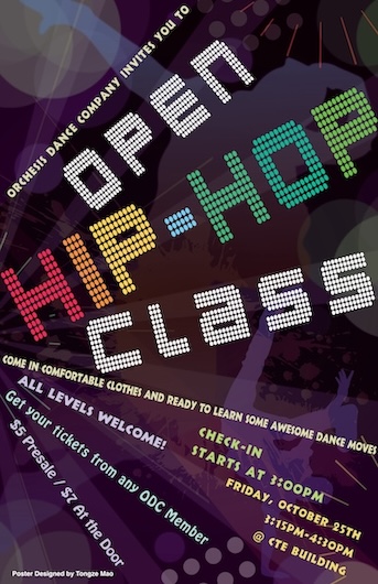
An earlier collaboration with the Orchesis Dance Company in 2018, where I designed a general event flyer for one of their dance showcases. This piece features elegant silhouettes of dancers and a harmonious blend of colors to reflect the grace and dynamism of dance. I focused on clear hierarchy in the text – the event title, date, and venue are immediately noticeable – while artistic flourishes add energy to the background. Creating this flyer provided my first experience working with a real “client” (the dance instructors) to meet their promotional needs. It taught me valuable lessons in communication and adaptability: I learned to iterate on my designs based on client feedback and to ensure the final output was print-ready with proper bleeds and high resolution. The success of the 2018 flyer set the stage for my continued relationship with Orchesis, including the more advanced recruitment poster I produced for them in 2019.
Annual Art Exhibition – Official Poster (2019)
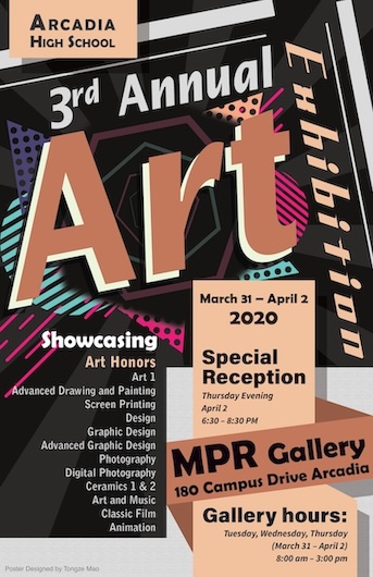
In 2019, I was selected to design the official poster for Arcadia High School’s Annual Art Exhibition, a showcase event celebrating student art across the district. This was both an honor and a significant responsibility, as the poster would serve as the primary advertisement for the exhibition to students, parents, and the community. I began by researching the year’s exhibition theme and reviewing prior years’ promotional materials. Wanting to create something fresh, I conceptualized a modern design featuring geometric shapes and a bold, contemporary color palette to reflect the diversity of art that would be on display (ranging from painting and photography to digital media). I used Adobe Photoshop and Illustrator to bring the concept to life, carefully integrating the event details into the artwork so that the information was clear without disrupting the visual flow. The final poster was printed and posted around campus and city community centers, helping to drive higher attendance to the exhibition. Event organizers praised the poster’s eye-catching aesthetics and how well it captured the spirit of the art show. This project was a capstone of my high school graphic design experience, allowing me to apply everything I had learned about visual hierarchy, thematic design, and audience engagement.
Principles of Design Educational Poster (2018)
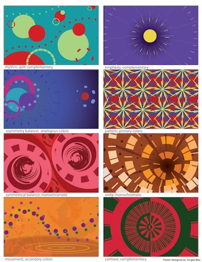
Created as a capstone project for my introductory graphic design class in 2018, this poster showcases my interpretation of the eight fundamental Principles of Design (Balance, Contrast, Emphasis, Movement, Pattern, Rhythm, Unity, and Variety). Rather than simply listing definitions, I designed a series of eight mini-illustrations within the poster, each visually demonstrating two principles in tandem. For example, one segment might display contrast through opposing colors while also illustrating balance in its symmetrical layout. Another segment could show rhythm via repeating shapes and incorporate variety with changing colors or sizes. By blending principles in each composition, I challenged myself to think creatively about how design concepts manifest visually. The overall poster is an educational piece that helped my classmates (and myself) better understand and remember these core ideas through art. This project underlined my ability to convey complex concepts through simple graphics.
“ULike” Brand Logo Designs (2019)
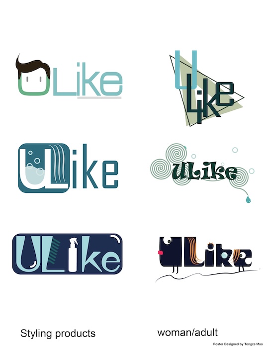
As part of my advanced graphic design course in 2019, I undertook a branding project to create a logo suite for a fictional bath products company named “ULike.” The challenge was to design six distinct logos that each present a creative concept for the brand. I explored a variety of styles – from playful and modern to elegant and minimalist – ensuring that each logo variation could represent the company in a unique way. This involved careful choice of color schemes (e.g. refreshing blues to evoke water or vibrant hues to suggest fragrances), typography that matched the brand’s personality, and iconography (such as abstract water droplets, leaf motifs for natural ingredients, etc.) to reinforce the product theme. Through multiple iterations and peer critiques, I refined each concept to be clear, scalable, and memorable. The final logos demonstrated my versatility in visual ideation and execution. This project was a valuable introduction to brand identity design, teaching me how consistency and creativity must balance when crafting the face of a company.
“Clean Campus” Environmental Sticker (2019)
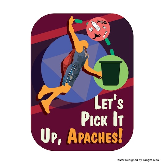
Designed in 2019 for an on-campus environmental initiative, this small “Clean Campus” sticker was created to encourage students to dispose of trash properly. It features a friendly cartoon graphic of a trash bin and a brief catchy slogan, making the message immediately clear: keep our campus clean by using the garbage cans. I chose bright, inviting colors and a simple illustration style to appeal to a broad audience. The sticker was printed and distributed widely; students could be seen pasting them on notebooks and water bottles, turning the campaign into a mini-trend. By condensing a public service message into a sticker-sized design, I learned how to maximize impact with minimal space – focusing on a single focal graphic and very concise text. The popularity of the sticker (many students wanted one) also taught me about the viral potential of relatable design. This project exemplifies using design skills for community benefit, and it sharpened my ability to communicate information at a glance.
Digital Illustration & Stickers
Crocodile Character Stickers (2021)
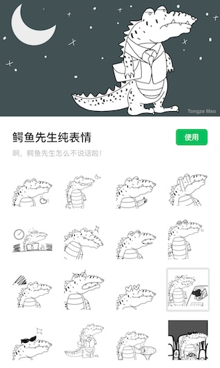
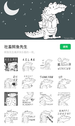
In 2021, I ventured into digital illustration for social media, creating a series of expressive crocodile character stickers. Shown above are two examples from the set, each featuring a cute, cartoonish crocodile in different moods. I developed this character to be both humorous and endearing, using a bold outline style and bright colors to ensure it stands out in chat messages. The process involved sketching by hand on a tablet and then vectoring the artwork for crisp scaling. These stickers were published in a popular messaging app’s sticker gallery, where they quickly gained traction – accumulating over 10,000 sends in chats. Users loved the crocodile’s playful expressions, from an eye-rolling sarcastic croc to a laughing, toothy grin. The popularity of this sticker pack was a rewarding validation of my digital illustration skills and taught me about designing for an interactive audience. It was exciting to see how a fun side project leveraging my artistic talents could resonate with thousands of people, much like a well-crafted piece of software can touch many users.
Links:
- Crocodile Sticker — Set A: View on WeChat Stickers
- Crocodile Sticker — Set B: View on WeChat Stickers
Fluffy Monster Sticker (2021)
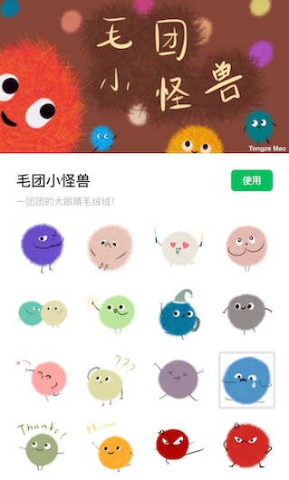
Another digital sticker created in 2021, this furry little monster character showcases a different art style. Aimed to be adorable and amusing, the monster has big round eyes and a shaggy, colorful body that make it instantly lovable. I designed it to convey a cheerful emotion – perfect for users to send as a reaction in chats. The sticker’s design emphasizes simplicity and bold shapes, which is key for readability at the small sizes used in messaging apps. After release, this single sticker surprisingly also garnered thousands of sends, proving popular among users who enjoyed its quirky charm. Through creating the monster and crocodile stickers, I learned how to adapt my artwork to meet the technical constraints of digital platforms (such as sizing and background transparency) and how important it is to capture a character’s personality in just one frame. This creative exercise in character design further broadened my skill set, and it underscores my ability to produce engaging content that can thrive in today’s digital communication channels.
Link:
- Fluffy Monster Sticker: View on WeChat Stickers
Achievements & Recognition
-
International Art Competition: Future Art China 2017 – Achieved Top 100 out of 10,000+ entries; artwork exhibited at the Lincoln Center (NYC) and featured in a commemorative art book.
-
School Poster Contests: Winner of multiple school-wide design competitions, including the Speech & Debate Team poster (selected from dozens of submissions) and the Arcadia High Art Exhibition poster (chosen to represent the entire event).
-
Campus Exhibitions: Numerous works selected for distinguished display – for instance, several of my posters and art pieces were chosen for permanent exhibition in school hallways and annual art shows, recognizing their impact and excellence.
-
Community & Client Impact: Designed real-world promotional materials for organizations (e.g. Orchesis Dance Company) that were implemented successfully, boosting engagement and attendance at events. These collaborations earned praise for their professionalism and effectiveness.
-
Digital Popularity: Created original sticker/emoji sets with 10,000+ uses in online chats, demonstrating an ability to produce viral digital content and connect with a broad audience through creative design.
Through these achievements, I’ve proven myself to be not only a high-performing student in academics but also a versatile creative talent. My dual background in technical and artistic fields means I bring a holistic skill set to any team: analytical problem-solving, a keen eye for design, and the drive to innovate. Whether it’s developing a software feature or crafting a visual campaign, I strive for excellence and impactful results – always with a blend of imagination and precision.